Providence Plantation Kitchen Remodel: From Dark and Cramped to Open and Bright
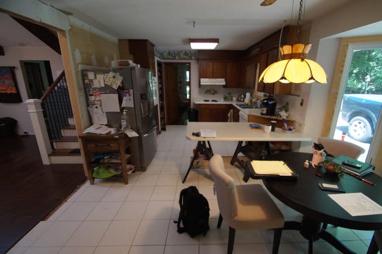
This 1960s ranch-style home in Providence Plantation was in need of a kitchen remodel. Its original, cramped kitchen had dark stained cabinets and an outdated fluorescent light in the middle of a dated, textured ceiling.
Open Floor Plan Kitchen Remodel in Charlotte
Palmer’s Project Goals and Challenges
- These homeowners wanted to remodel their home’s original kitchen into an open and bright space with improved storage that functioned well.
- Textured ceilings from this era typically contain trace amounts of asbestos.
Solutions
- To eliminate the textured ceiling without risking disturbing an area that potentially contained trace amounts of asbestos, we sheet rocked over the existing textured ceiling. That protected the health of the homeowners, sped up the process, and gave them the smooth ceiling finish they wanted.
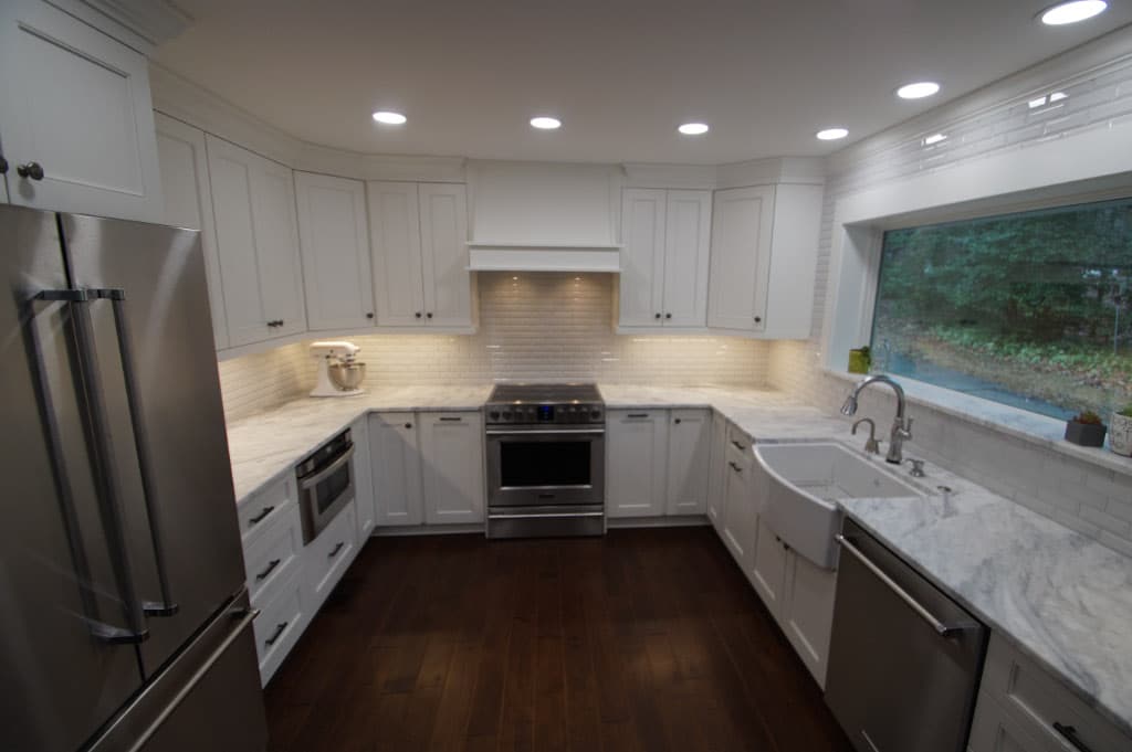
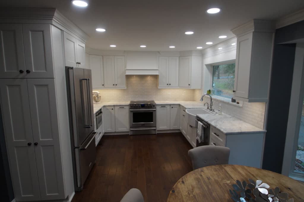
- To improve the flow of the kitchen, we closed off a door that originally led to a formal dining room. Since the homeowners now use that space as an art studio, there was no need for connectivity between the rooms. This change allowed us to create a U-shaped kitchen with wraparound cabinets and a much improved traffic flow.
- To further increase useable cabinet space, we removed an undersized corner pantry and replaced it with upper and lower cabinets.
- We moved the refrigerator slightly to allow for the placement of floor to ceiling pantry cabinets on its left.
- We removed existing wall outlets and replaced them with a continuous plug mold underneath the upper cabinets. This created more spaces to plug in appliances where they are actually needed while preserving the beauty of the backsplash – a striking subway tile with a beveled edge and a crackle finish. The kitchen was designed with this gorgeous tile in mind. It was discontinued by the manufacturer right before the order was placed, but our designer saved the day by finding an identical tile.
- We removed a non-functional wet bar, relocated the existing electrical panel and created a straight path to the back door with a mudroom area. The homeowners previously had relocated the laundry room to be closer to the master bedroom, but we enhanced and upgraded this area in case they or a future buyer wanted to bring it back. We created a 4’ wide closet with floor-to-ceiling shelves to provide ample pantry storage. The mudroom area now includes a deep closet for coats and vacuum storage.
- To brighten up the space, we used slimline 5000K LED flush lights and put them on a dimmer to give the homeowners better lighting control. Under cabinet lighting added essential task lighting to the space.
- Natural light was increased by removing the existing 3’ x 3’ window above the kitchen sink and replacing it with a 3’ x 6’ picture window above a clay farm sink. Structurally, we beefed up the framing to support the longer span and had a mason rebrick the area where we had to remove brick to install the new window. Since the exterior was painted brick, the change looks seamless.
- All new cabinets and appliances, including an exhaust unit with a custom hood made to match the cabinet design, updated the space.
- We installed prefinished hardwood floors in the kitchen and breakfast area, and installed tile flooring in the half bath and mudroom after correcting some wood rot and uneven floor issues there.
- We installed a new fiberglass rear door to increase security and installed pocket doors for the half bath and mudroom. Crystal doorknobs gave the other doors the prefect finishing touch.
- The end result is a beautiful, bright and light kitchen with far more vertical storage that gave the homeowners the organized and functional space they envisioned.


