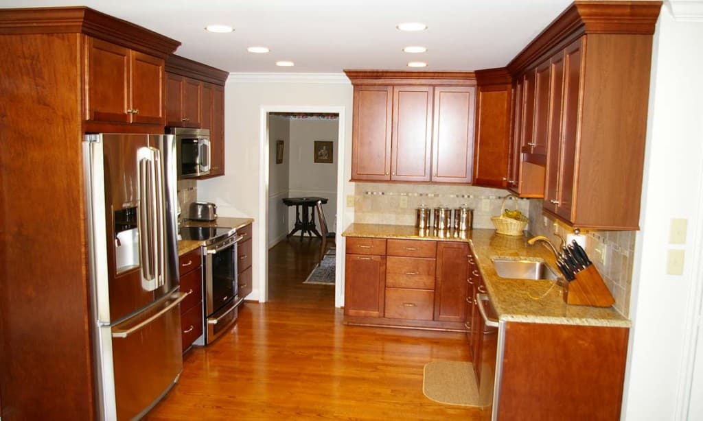
Kitchen renovation
This kitchen renovation project began simply enough, with the homeowners going shopping to replace their outdated, 20-year-old appliances. When they discovered that their options would be very limited if they wanted to replace their existing 27″ slide-in oven with a model of the same size, they seized the opportunity to reconfigure the kitchen layout to better fit their current lifestyle needs.
Palmer’s Project Goals and Challenges
- This kitchen needed updating on several levels. Aside from their outdated appearance, the oak stained cabinets extended all the way up to the ceiling, but their doors did not, making it difficult for the homeowners to easily access this storage space. An inadequately sized peninsula jutted out into the room and broke up the flow of traffic in the kitchen. The awkward placement of the refrigerator next to the door made it difficult to work productively in the space.
- Small, dark wood trim and inadequate lighting further dated the space.
- A dropped soffit over the breakfast area proved to be a challenge. The homeowners initially were reluctant to remove it, due to the added expense of reframing that portion of the ceiling. Yet it closed in the area, making it seem dark and unwelcoming. Grilles on the windows broke up yet more of the view.
Solutions
- To make the kitchen function properly, we moved a new refrigerator to a more central location and then reconfigured the placement of the rest of the new, stainless steel appliances to put them in more workable locations. New cabinets with a simple, timeless design in a rich finish topped with subtle granite countertops gave the space a fresh look.
- We removed the peninsula, and replaced it as well as the existing table in the breakfast nook with a new island, which opened up the kitchen. The island features a properly sized granite-topped eating surface with additional storage cabinets beneath.
- Inadequate overhead lighting was replaced with properly sized recessed cans. We removed the small, stained crown and trim molding and installed larger painted crown, base and trim molding, which thoroughly updated the appearance of the house. Hardwood floors were refinished to match, which allows the spaces to blend seamlessly.
- As we continued to work on this project, the homeowners’ level of trust in us grew, and they listened to our recommendation about removing the dropped soffit. It was torn out, and then the ceiling was reframed and made a consistent height across the entire span of the kitchen/breakfast area. The window grilles were removed, so the homeowners now have a clear view to the natural areas in their backyard. The homeowners could not be happier, reporting that the space is now the bright and open area they envisioned and looks 30 percent larger, even though the actual size of the area did not change.


